Hello there today i will show you how to a make cool graph on the bitcoins high and lows, you can use this to create your own monitoring system for the #cryptos of your interest, the elements we are going to use is Apache for web server, PHP as server side programing Json for hold our data set and for last we would use Chart.js to make the graphs, this could be extendable to create a super chart holding what ever you want to show , i will try to extended and publish a more complete project, but for the scope of this tutorial we are ok. Nice so lets get to it.
The first thing you will need is to get Bitcoin Dataset on the high and lows you can get those using R programing or using an API from other website. I will assume you did that as a hint, i will tell you you can create a PHP script to retrieve the data en inject that into Postgresql database, and after that set a Cron job that runs that script every 5 minutes or so, that would the trick.
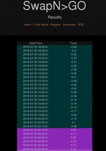
You will need to record two things the time and the data so at the end you will get something like this
Ok cool you got your data-set you got your Cron job getting that data into PostgreSQL so now lets convert that into a graph that can be study easily first you will need to convert the database information into JSON format, for that follow this code:
<?php
//setting header to json
header(‘Content-Type: application/json’);
//$option=$_POST[‘option’];
$link = pg_connect(“host=127.0.0.1 port=5432 dbname=tracking user=postgres password=123456”);
if (!$link) {echo “Could not connect to central node STEP 1.\n”; exit;}
$result = pg_query($link,”select tiempo, bitcoin from HL_tracking”);
//loop through the returned data
$data = array();
while($row=pg_fetch_assoc($result)){
$data[] = $row;
}
pg_close($db);
print json_encode($data);
?>
Now to put that in use you will need to use you web browser go to your web server and run that code, it will generate a Json array. Keep your Web Developer tools at hand we will use them to validate that all is good in the next step. Ok now you need another two files an html file that will hold the the canvas for the graph and application in Ajax to create the graph. Lest see the html file first.
<!DOCTYPE html>
<html>
<head>
<meta charset=”utf-8″>
<title>LinuxTrader Graphics</title>
<style type=”text/css”>
#chart-container {
width: auto;
height: auto;
}
</style>
</head>
<body>
<div id=”chart-container”>
<canvas id=”mycanvas”></canvas>
</div>
<!– javascript –>
<script type=”text/javascript” src=”js/jquery.js”></script>
<script type=”text/javascript” src=”js/chart.min.js”></script>
<script type=”text/javascript” src=”js/app.js”></script>
</body>
</html>
That was easy right? We set to auto both ranges of the chart so it could be fully deployed on web browser. and very important at the end we load the necessary JavaScript. Jquery-min.js comes from Jquery project the chart.min.js comes from Chart.js project and app.js comes from us we need to create that file and set the code from our graph. Lets see how:
$(document).ready(function(){
$.ajax({
url: “http://127.0.0.1/swapngo.org/proyecta_json.php”,
method: “GET”,
success: function(data) {
console.log(data);
var tiempo = [];
var bitcoin = [];
for(var i in data) {
tiempo.push(“Date ” + data[i].tiempo);
bitcoin.push(data[i].bitcoin);
}
var chartdata = {
labels: tiempo,
datasets : [
{
label: ‘Bitcoin’,
backgroundColor: ‘rgba(78, 153, 224)’,
borderColor: ‘rgba(200, 200, 200, 0.75)’,
hoverBackgroundColor: ‘rgba(200, 200, 200, 1)’,
hoverBorderColor: ‘rgba(200, 200, 200, 1)’,
data: bitcoin
}
]
};
var ctx = $(“#mycanvas”);
var barGraph = new Chart(ctx, {
type: ‘line’,
data: chartdata
});
},
error: function(data) {
console.log(data);
}
});
});
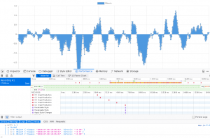
OK so you can see that in this code we feed the app using our JSON file plus we give some pointers to the graph like the type of graph we want using this data set structure you can easily go from a bar graph to a linear graph by changing the TYPE parameter. The code is easy to understand we create to variables this are the two columns in our database table, the we run trough the the table and we push that data into the graph and last we deploy the data using RGBA colors you can easily modify this color. When you go to the html file you will get something like this:
Now that gives you something to think about now you could cover more in your data-set like the price of the currency and adjust your export program to JSON format and add another variable to the chart and just like that you build you own monitoring system for bitcoin or any Crypto you like.
How to go even deeper ? well lots of things can be done one thing i am particular interested is in how to do this in absolute REAL TIME for example lets say you adjust the Cron job to retrieve the data every 5 seconds or hell every 2 seconds that is REAL TIME for me but that will cause overload in the server running the job that is fact but lets say your machine or cluster can handle that, you can think in open a stream query that is always getting that data and do the whole cycle to put the data in the graph. what do you think? i will love to hear thoughts about it. Anyways that is all i got for you today hope you find this article useful. See you later alligator. Hey if you have any questions let me know.

